
Aceternity UI
Access a large library of ready-to-use UI components for effortless website design.
Loading section…
Access a large library of ready-to-use UI components for effortless website design.
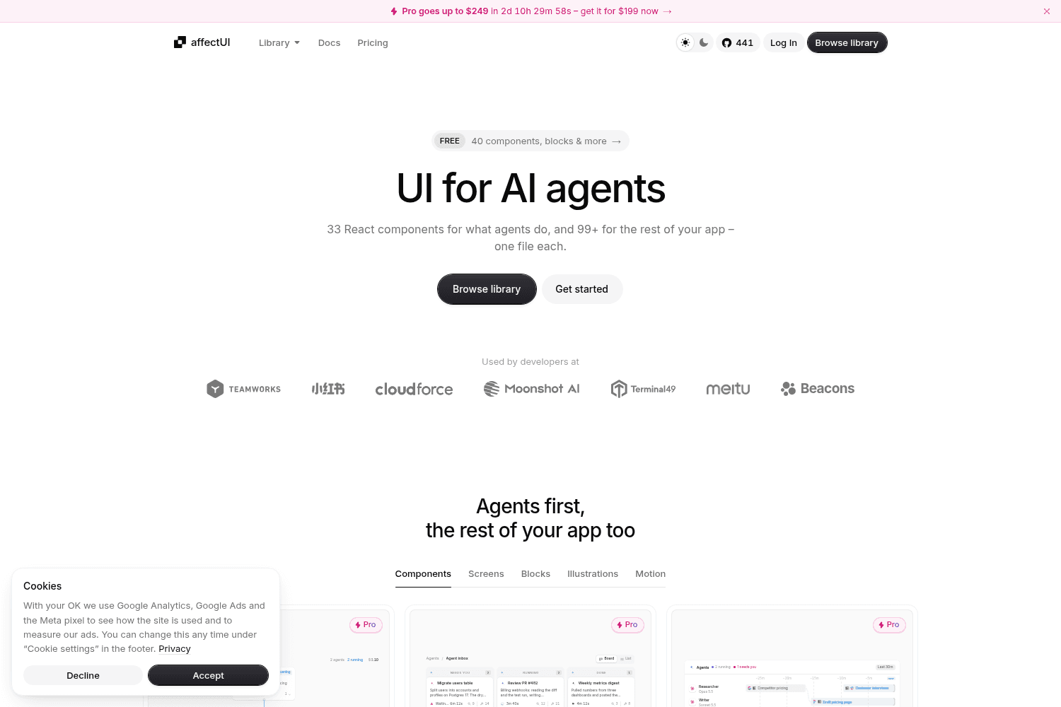
affectUI is a library of hand-designed React components designed specifically for AI applications. I...

beUI is a motion toolkit designed for React and Next.js applications, providing animated components ...

Create UI is a comprehensive design system and React component library, providing designers and deve...

Shadcn UI Kit is a comprehensive toolkit featuring production-ready UI blocks designed for modern we...

Tool for building interfaces using Tailwind CSS.
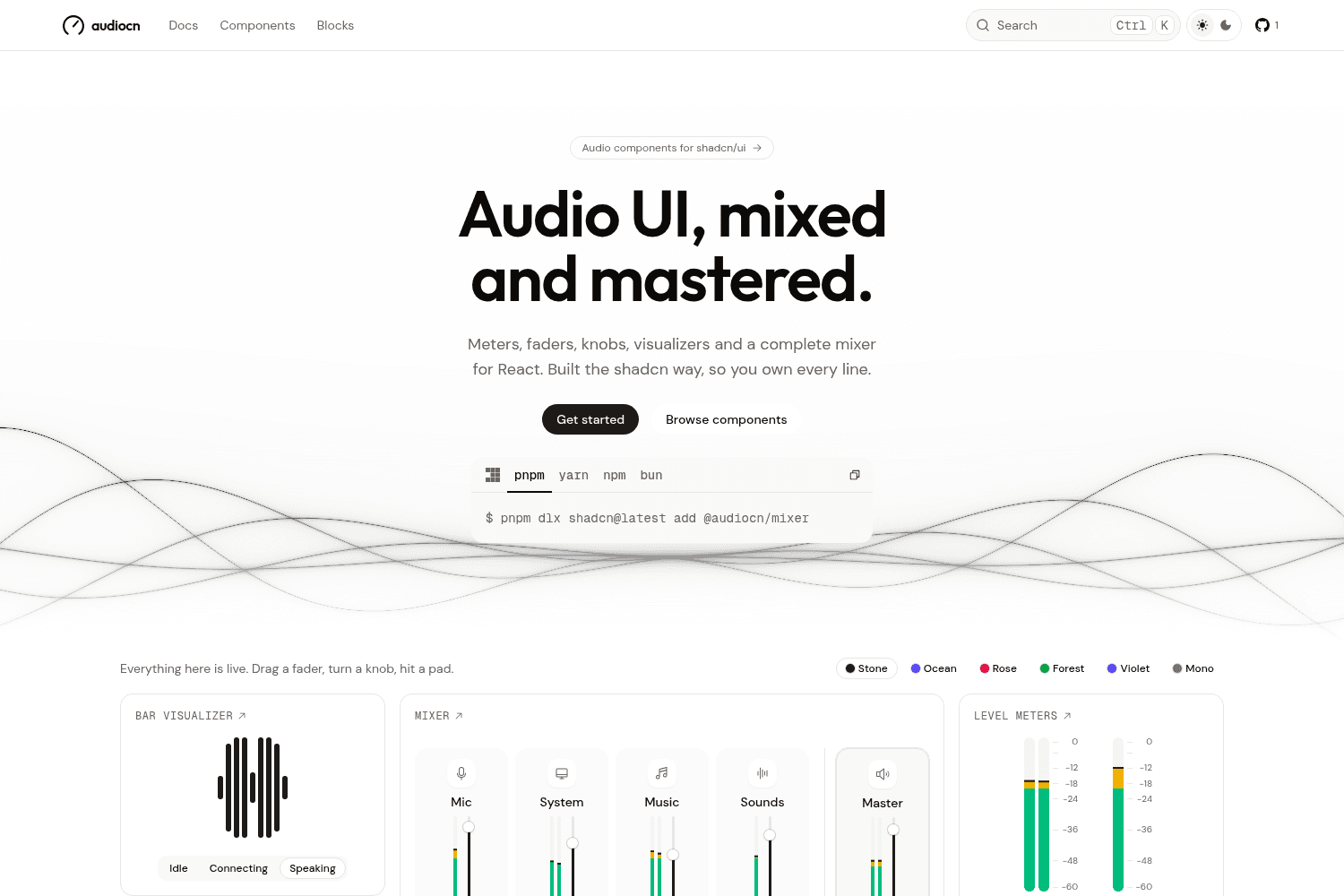
Audio UI offers a collection of interactive audio components designed specifically for React applica...
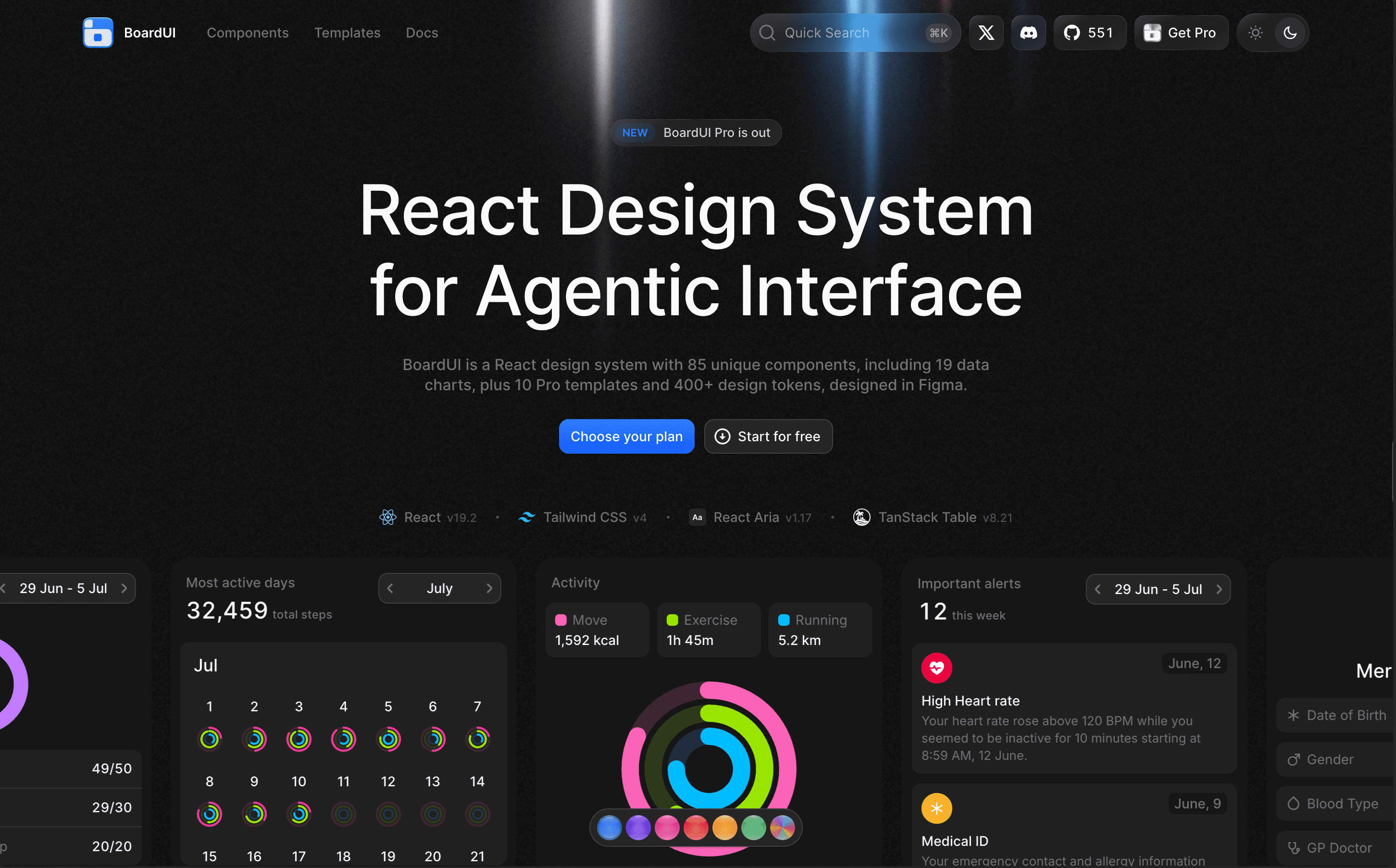
BoardUI is a comprehensive React design system offering a collection of components, templates, and d...

Rare UI is a free, open-source collection of unique animated React components, designed to stand out...
New logo cloud block that flips between two sets of logos on a timer, designed to fit seamlessly under a hero or above a footer.
Pro blocks that provide clear next steps when a list or workspace is empty, offering simple and interactive designs.
Addition of a Blog With Categories block that displays curated posts with categorization for easier navigation.
A new Magnetic Button feature that makes buttons move toward the cursor on hover, creating interactive call-to-actions.
Introduced Squiggly Text that wraps text in a wobbly SVG filter for a playful, hand-drawn effect, suited for creative headings.
New design feature for CTAs that incorporates centered text and buttons over a soft grid of product images.
Introduction of a Hero section with a large prompt field situated at the forefront, designed for user engagement.
Added Draggable Cards feature for users to swipe through a card stack in a dynamic manner.
New Slider Illustration component that allows users to map tiers alongside detailed copy, enhancing interactivity.
Introduced a new team section that presents team profiles with status badges and social links, facilitating quick introductions.


