
Open-source React UI library for faster development. Includes animations, Tailwind CSS.

Embed a robust video editor into React apps, saving hours with full code access
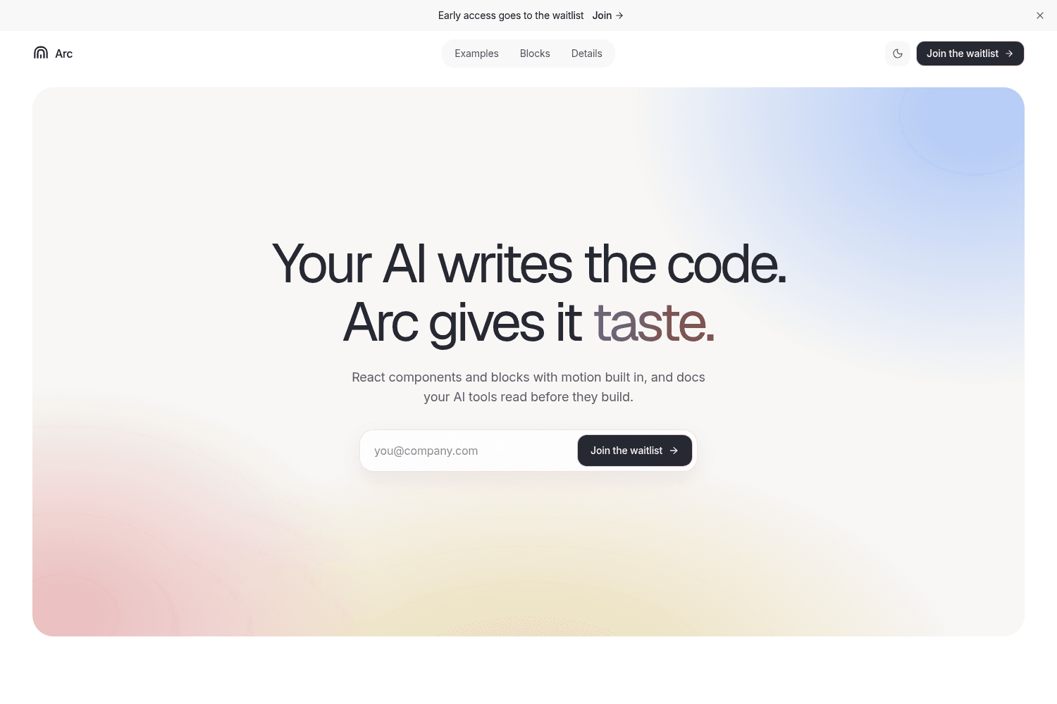
Arc provides a library of interactive React components and blocks to accelerate UI development, enha...

Modern React building blocks for web apps, compatible with all React frameworks. Free and open sourc...
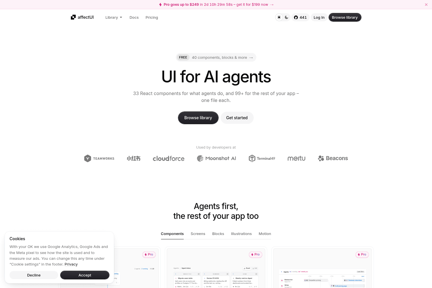
affectUI is a library of hand-designed React components designed specifically for AI applications. I...

UI design inspiration delivered directly to your inbox.

Customizable color palette for Radix UI components.

beUI is a motion toolkit designed for React and Next.js applications, providing animated components ...
Explore tools in similar categories to React Bits.
BadtzUI
Open-source React UI library for faster development. Includes animations, Tailwind CSS.
React Video Editor
Embed a robust video editor into React apps, saving hours with full code access
Arc
Arc provides a library of interactive React components and blocks to accelerate UI development, enhancing creative workflows with motion elements.
blocks.so
Modern React building blocks for web apps, compatible with all React frameworks. Free and open source.
affectUI
affectUI is a library of hand-designed React components designed specifically for AI applications. It offers both free and paid components, making it versatile for any project.
UI Bits
UI design inspiration delivered directly to your inbox.
Radix UI
Customizable color palette for Radix UI components.
beUI
beUI is a motion toolkit designed for React and Next.js applications, providing animated components and a structured way to integrate motion into your web projects.
BoardUI
BoardUI is a comprehensive React design system offering a collection of components, templates, and design tokens tailored for building user interfaces in web applications.
Rare UI
Rare UI is a free, open-source collection of unique animated React components, designed to stand out and enhance web applications with creative elements.
Audiocn
Audio UI offers a collection of interactive audio components designed specifically for React applications, enabling developers to easily integrate audio features without extensive coding.
Reverse UI
Premium animated UI components for seamless web app integration
Shadcn UI Kit
Shadcn UI Kit is a comprehensive toolkit featuring production-ready UI blocks designed for modern web apps.
23rd
23rd is a registry of opinionated UI components designed for React and Svelte 5, aiming to reduce boilerplate and enhance design consistency across projects.
NextBunny
NextBunny is a visual development platform designed for creating and exporting React components seamlessly with Tailwind CSS integration.
Shadcnblocks
Shadcnblocks offers 401 premium blocks for Tailwind and React projects.
Kinetics
Kinetics offers a library of 117 unique motion patterns designed for use in both CSS and React environments, enabling designers to implement high-quality animations without the need for external dependencies.
Create UI
Create UI is a comprehensive design system and React component library, providing designers and developers with a single source for over 65 production-ready UI components, seamlessly integrated into Figma.
Sort UI
Sort UI is a Figma UI kit and React component library built on shadcn/ui, offering thousands of components and numerous landing sections for seamless design and coding.
SVG to Code
Figma plugin converting SVGs into React components for easy use in code.
Frameblox
UI kit with pre-built sections in Framer for easier website building.
Originkit
Originkit is a platform providing a vast collection of interactive web components, allowing users to enhance their projects with visually appealing designs and effects. It caters to developers and designers looking to create engaging user experiences.
Border Beam
Border Beam is an animated border component designed for easy integration in web applications, providing developers with tools to personalize and enhance their UI.
Atomize Design
Design system for Figma


