
Shadcn UI Kit
Accelerate web development with customizable UI blocks and templates for rapid project delivery.
Loading section…
Accelerate web development with customizable UI blocks and templates for rapid project delivery.

Shadcnblocks offers 401 premium blocks for Tailwind and React projects.

Accessible UI components.

Premium Figma UI kit for rapid design with full theming options.

Modern React building blocks for web apps, compatible with all React frameworks. Free and open sourc...
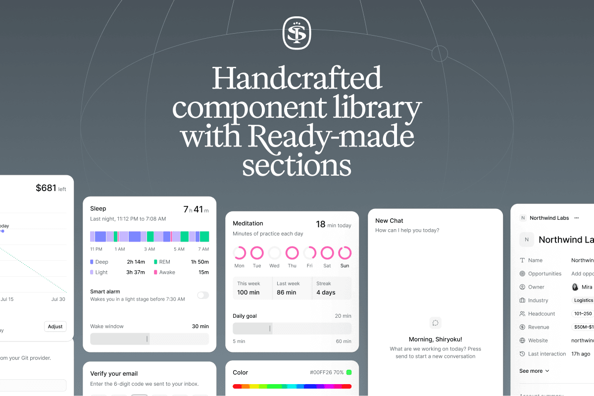
Sort UI is a Figma UI kit and React component library built on shadcn/ui, offering thousands of comp...
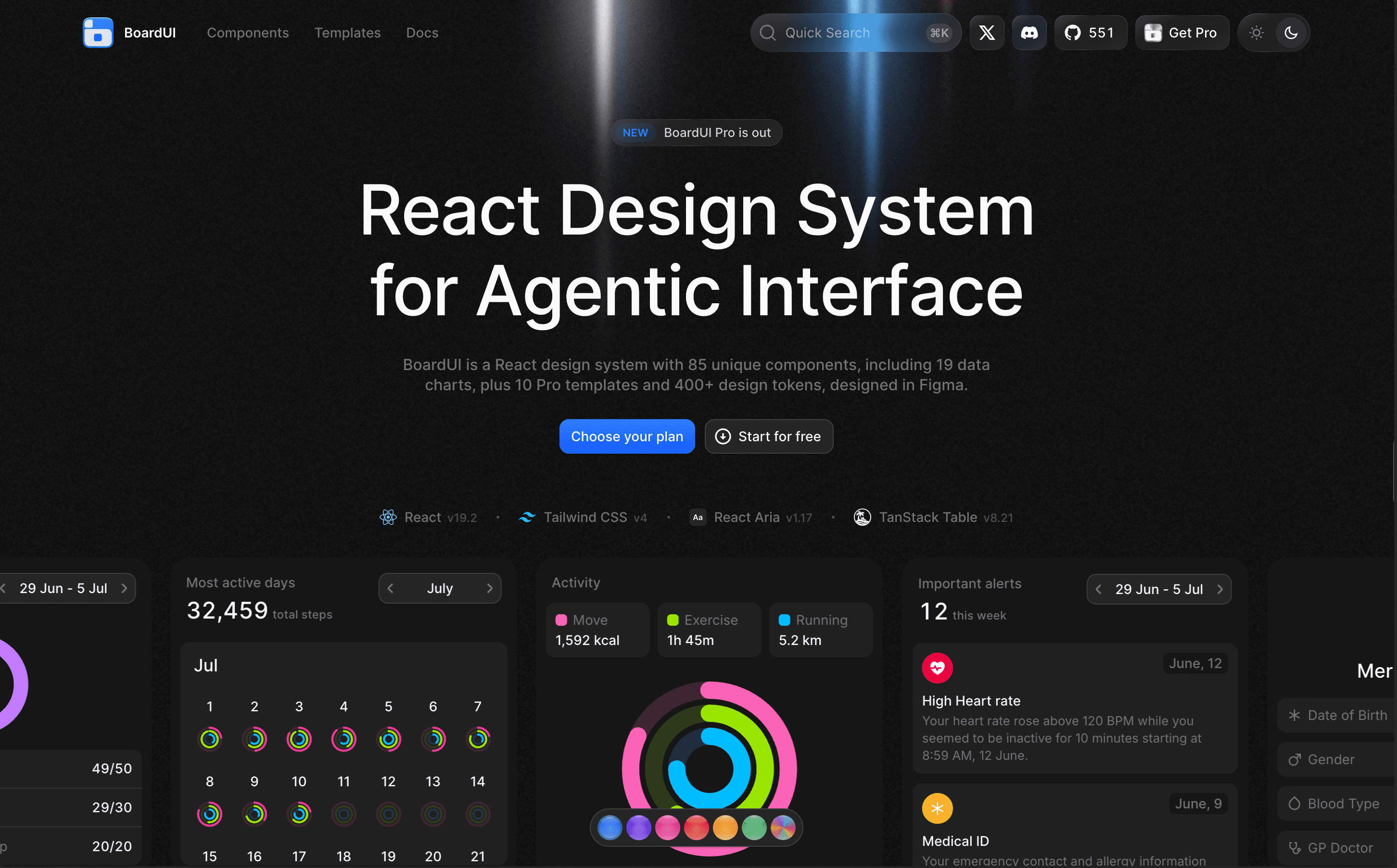
BoardUI is a comprehensive React design system offering a collection of components, templates, and d...

Interactive UI components built with Tailwind CSS & shadcn for React and Next.js

Rare UI is a free, open-source collection of unique animated React components, designed to stand out...
Explore tools in similar categories to Shadcn UI Kit.
Shadcnblocks
Shadcnblocks offers 401 premium blocks for Tailwind and React projects.
ShadCN UI
Accessible UI components.
Shadcraft
Premium Figma UI kit for rapid design with full theming options.
blocks.so
Modern React building blocks for web apps, compatible with all React frameworks. Free and open source.
Sort UI
Sort UI is a Figma UI kit and React component library built on shadcn/ui, offering thousands of components and numerous landing sections for seamless design and coding.
BoardUI
BoardUI is a comprehensive React design system offering a collection of components, templates, and design tokens tailored for building user interfaces in web applications.
KokonutUI
Interactive UI components built with Tailwind CSS & shadcn for React and Next.js
Rare UI
Rare UI is a free, open-source collection of unique animated React components, designed to stand out and enhance web applications with creative elements.
Tailark
Responsive UI blocks for marketing sites using TailwindCSS and React.
Shaders
Shaders is a powerful design platform that allows users to create stunning, interactive WebGPU effects without needing extensive coding skills. It enables design engineers to produce visually appealing web applications quickly and efficiently.
Create UI
Create UI is a comprehensive design system and React component library, providing designers and developers with a single source for over 65 production-ready UI components, seamlessly integrated into Figma.
Stylokit
Stylokit is a design resource platform offering a curated library of templates, UI kits, and components for designers and developers, making it easier to find quality design assets.
Audiocn
Audio UI offers a collection of interactive audio components designed specifically for React applications, enabling developers to easily integrate audio features without extensive coding.
23rd
23rd is a registry of opinionated UI components designed for React and Svelte 5, aiming to reduce boilerplate and enhance design consistency across projects.
Beyond UI
Premium Figma UI kit for SaaS apps with 9,000+ components. Ideal for startups and designers.
Untitled UI
UI design templates and resources
affectUI
affectUI is a library of hand-designed React components designed specifically for AI applications. It offers both free and paid components, making it versatile for any project.
Dnd Kit
Dnd Kit is a framework-agnostic library for building drag and drop interfaces, enabling developers to easily integrate this functionality into projects with any JavaScript framework.
beUI
beUI is a motion toolkit designed for React and Next.js applications, providing animated components and a structured way to integrate motion into your web projects.
BadtzUI
Open-source React UI library for faster development. Includes animations, Tailwind CSS.
Frames X
Figma UI kit offering unique design mockups and templates
Aceternity UI
UI component library.
React Bits
React Bits offers a collection of customizable animated React components and backgrounds that enhance any project's UI, allowing developers to quickly implement visually appealing features.
Arc
Arc provides a library of interactive React components and blocks to accelerate UI development, enhancing creative workflows with motion elements.


