Untitled UI
Access the largest Figma UI kit and React components for swift, consistent design.
Loading section…
Access the largest Figma UI kit and React components for swift, consistent design.
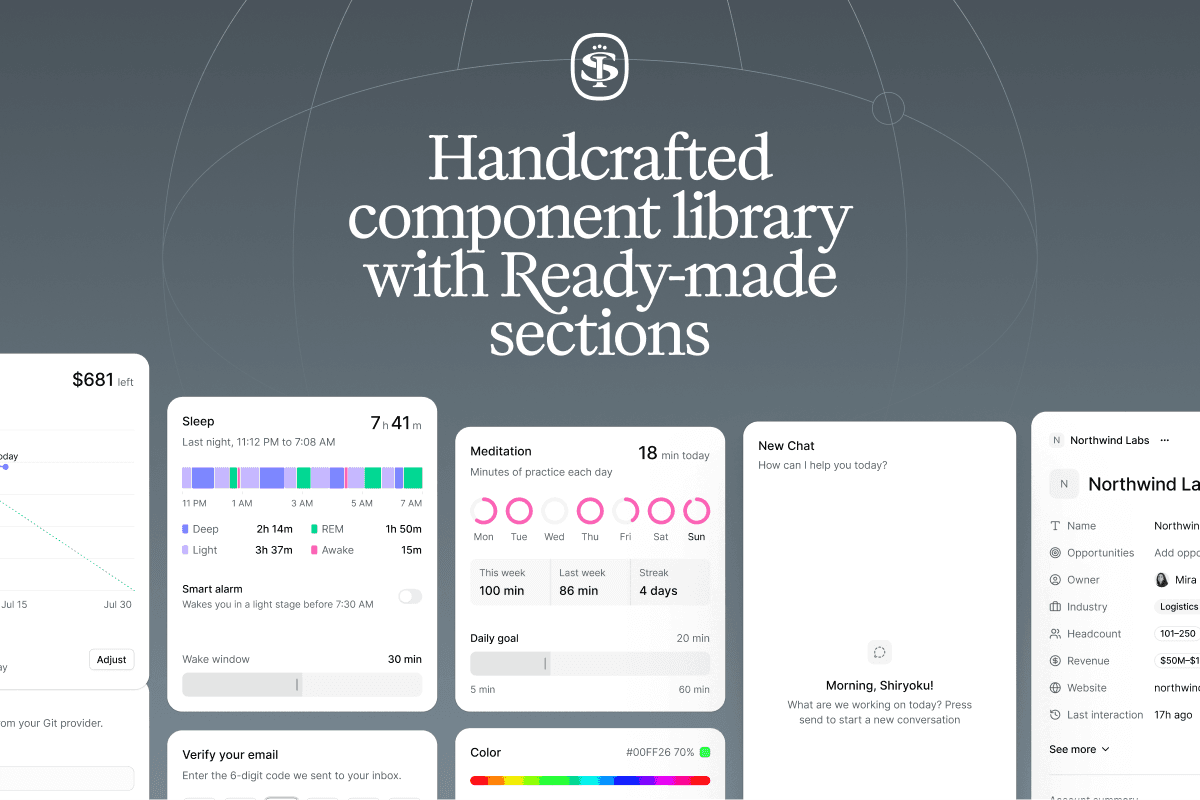
Sort UI is a Figma UI kit and React component library built on shadcn/ui, offering thousands of comp...

Create UI is a comprehensive design system and React component library, providing designers and deve...

Premium Figma UI kit for SaaS apps with 9,000+ components. Ideal for startups and designers.

Premium Figma and Framer UI kits for faster design workflows. Ready-to-use components.
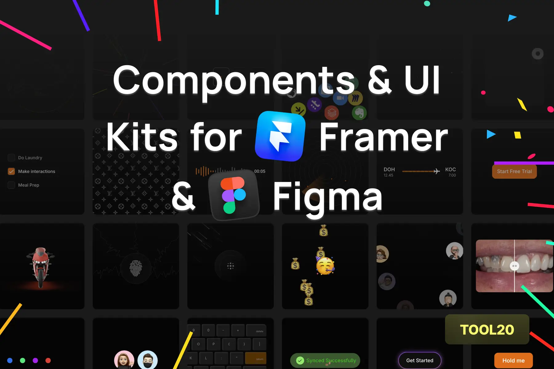
UI design tool for creating design systems in Framer.

Comprehensive set of Figma UI kits for web and mobile
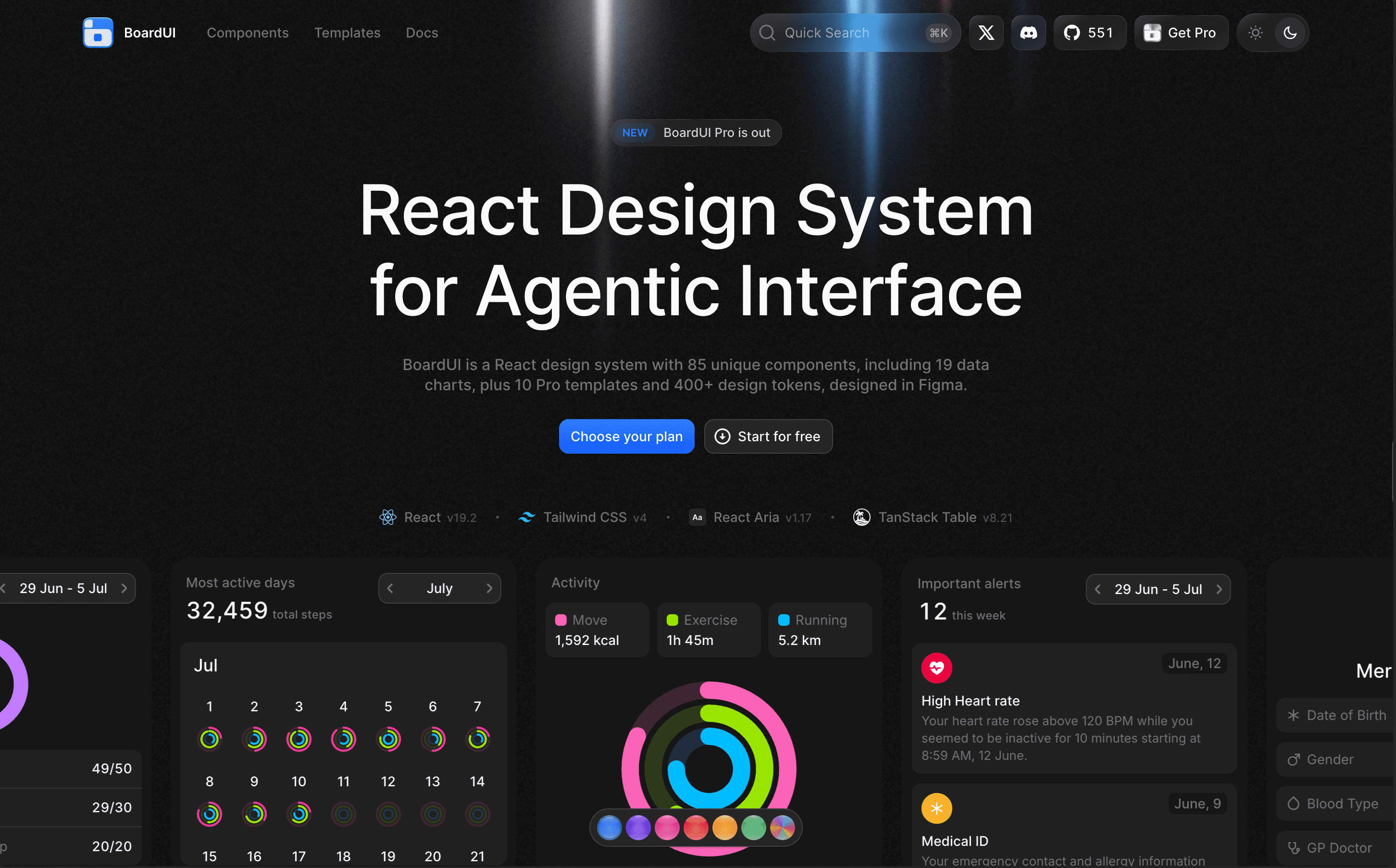
BoardUI is a comprehensive React design system offering a collection of components, templates, and d...

UI kit designed for Figma to simplify design processes.
Explore tools in similar categories to Untitled UI.
Sort UI
Sort UI is a Figma UI kit and React component library built on shadcn/ui, offering thousands of components and numerous landing sections for seamless design and coding.
Create UI
Create UI is a comprehensive design system and React component library, providing designers and developers with a single source for over 65 production-ready UI components, seamlessly integrated into Figma.
Beyond UI
Premium Figma UI kit for SaaS apps with 9,000+ components. Ideal for startups and designers.
Sort UI
Premium Figma and Framer UI kits for faster design workflows. Ready-to-use components.
Segment UI
UI design tool for creating design systems in Framer.
NovaUI
Comprehensive set of Figma UI kits for web and mobile
BoardUI
BoardUI is a comprehensive React design system offering a collection of components, templates, and design tokens tailored for building user interfaces in web applications.
GlowUI
UI kit designed for Figma to simplify design processes.
Name That UI
Name That UI is a visual dictionary designed for developers and designers, helping them accurately name UI elements and understand their terminology.
UIverse
Community-built library of UI elements in HTML/CSS, Tailwind, React, and Figma.
UI8
Curated marketplace offering premium UX/UI design assets and templates for creators.
affectUI
affectUI is a library of hand-designed React components designed specifically for AI applications. It offers both free and paid components, making it versatile for any project.
Reverse UI
Premium animated UI components for seamless web app integration
Preline UI
Design system crafted with Tailwind CSS styles
Frames X
Figma UI kit offering unique design mockups and templates
Rare UI
Rare UI is a free, open-source collection of unique animated React components, designed to stand out and enhance web applications with creative elements.
Shadcn UI Kit
Shadcn UI Kit is a comprehensive toolkit featuring production-ready UI blocks designed for modern web apps.
Stylokit
Stylokit is a design resource platform offering a curated library of templates, UI kits, and components for designers and developers, making it easier to find quality design assets.
beUI
beUI is a motion toolkit designed for React and Next.js applications, providing animated components and a structured way to integrate motion into your web projects.
Airtable Apps UI Kit
Create custom Airtable apps with an intuitive UI kit on Figma
Beautiful UI
Beautiful UI specializes in providing components specifically designed for AI-native interfaces, offering customizable solutions to enhance user experience and facilitate interaction.
Magic UI
50+ free open-source animated components built with React and Tailwind.
Practical UI
E-book and practical design system resources for Figma.
Frameblox
UI kit with pre-built sections in Framer for easier website building.